Why Users Prefer Dark Mode In Web Design – A few years ago, dark mode was mostly favored by developers, gamers, and night owls who used it to reduce eye strain and screen glare. Today, it has become a standard expectation among everyday users.
What began as a simple visual preference has now turned into an essential part of modern web design — one that impacts usability, accessibility, and the overall perception of your brand.
Want to know how to make dark mode shine on your website? Here’s what we’ll explore in this guide:
• What Is Dark Mode Web Design?
• Why Users Love Dark Mode
• Design Considerations for a Dark Mode Website
• How To Make Any Website Dark Mode: Technical Implementation
• Accessibility Considerations in Dark Mode
What Is Dark Mode Web Design?
Dark mode, sometimes called “night mode,” features light text on dark backgrounds. It reverses the traditional light mode interface and offers a sleek, eye-friendly experience.
What started as a trend became a user experience (UX) standard around 2019 to 2020 when major operating systems like iOS, Android, Windows, and macOS introduced system-wide dark themes. This move encouraged websites and apps to adapt as well.
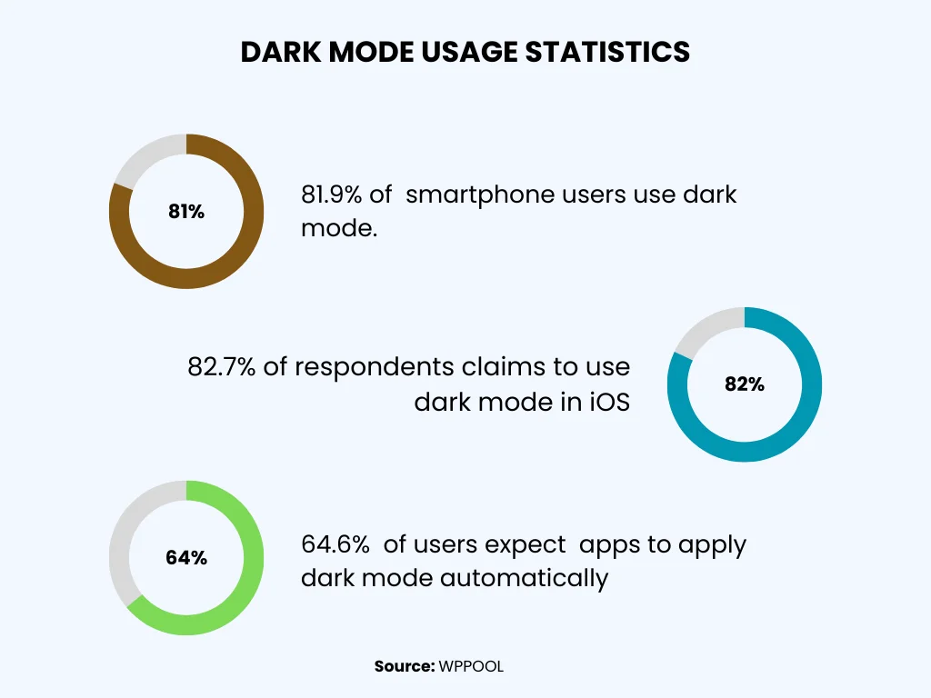
With this, user adoption skyrocketed. In 2025, around 82% of smartphone users had dark mode enabled. Even Apple users, who had long been tied to light mode by default, embraced the change. More than half now use dark mode regularly. This includes browsing Safari web pages in dark mode or customizing settings on mobile apps.
Some of the internet’s most prominent platforms adjusted accordingly. Dark mode updates rolled out across Google’s search and core web apps after becoming one of the most requested features. Wikipedia, long known for its bright interface, launched a beta version of its dark mode in 2023.
On the browser side, users also turned to tools like dark mode extension options for custom theming, which is especially popular with Chrome dark mode users seeking consistency across websites.
Social media platforms were early adopters of the trend. Twitter (now X) debuted its “Night Mode” in 2017 and made it the default in 2023.
Design Tips for a Dark Mode Website
Dark mode isn’t just easier on the eyes—it’s also a smart design choice. With more users expecting dark themes, a well-designed dark mode can improve comfort, engagement, and how people see your brand.
Here’s what to keep in mind when designing a dark mode website:
1. Color Contrast and Readability
Text must be easy to read. Avoid pure black (#000000) backgrounds—they can feel too harsh. Instead, use dark gray or off-black tones. Similarly, avoid using pure white (#FFFFFF) text; softer whites or light grays reduce glare while remaining readable.
Check your text contrast to make sure it meets accessibility standards. The WCAG suggests a text-to-background ratio of at least 4.5:1. Tools like WebAIM’s Contrast Checker can help.
Also, remember that some users may have browser dark mode features enabled, which can slightly change how your site looks. Designing with this in mind ensures consistency across devices.
2. Visual Hierarchy and UI Elements
Creating a clear hierarchy in dark mode requires a few tricks:
Layer with Color: Use dark shades at different brightness levels to show depth and separate sections.
Highlights and Borders: Subtle outlines or glows can help define buttons and other elements.
Interaction States: Use brighter accent colors to show hover, active, or focused states.
Soft Shadows: Instead of black shadows, try translucent white or light-colored glows for a natural look.
3. Keep Your Brand Consistent
Dark mode should still feel like your brand. Adjust logos, colors, and images to suit dark backgrounds without losing recognition. Some colors may need slight tweaks to stay visible and maintain the right mood.
4. Design for Different Devices
Dark mode can look different depending on the screen type. OLED, LCD, and high-density displays render colors differently, and ambient light affects visibility. Make sure your dark mode looks good in both dim and bright environments, whether on a phone, tablet, or desktop.
How to Add Dark Mode to Any Website: Simple Steps
Creating a dark mode isn’t just about changing background colors. Here’s how to do it properly:
1. Use CSS Media Queries
Modern devices let users choose light or dark mode. You can use CSS media queries to automatically match your website to their preference.
2. Add a Dark Mode Toggle
Give users the option to switch between light and dark modes with a button or icon. This small feature makes your site more personal and user-friendly.
3. Update Visuals for Dark Mode
Make sure all images, icons, and illustrations look good in dark mode. Some files, like transparent PNGs, may become hard to see. Adjust them so they stay clear and attractive in both light and dark themes.
4. Test Everything
Before going live, check your dark mode on different browsers and devices. Look for color issues, layout problems, or readability concerns. Testing ensures a smooth experience for all users.
Accessibility Tips for Dark Mode
While dark mode can be easier on the eyes for many, it can also create problems for some users. Here’s how to make your dark mode accessible for everyone:
1. Make Text Easy to Read
Good contrast is essential. Light-colored text on dark backgrounds usually works best. Keep these tips in mind:
Ensure all text—paragraphs, links, buttons, and form fields—has enough contrast. Headings and large text can be slightly less contrasted (3:1 ratio) and still be readable.
Avoid using dark gray text on black backgrounds. It may look fine on high-quality screens but can be hard to read on average monitors or mobile devices.
Always prioritize clarity over making it “minimal” or stylish. Users notice when text is hard to read, even if they use a dark mode extension.
2. Choose Colors Carefully
Not everyone sees colors the same way. For example, red for errors and green for success might be hard to distinguish on dark backgrounds for users with color vision issues.
Pair color with other indicators like icons or labels.
Use brighter or higher-contrast shades rather than muted tones to make important elements stand out.
3. Respect User Preferences
Some users may find light text on dark backgrounds uncomfortable, especially those with eye conditions like astigmatism.
Always let users switch between light and dark modes.
Providing options, like a manual toggle or respecting system dark mode settings, gives users control over their experience.
Conclusion
Dark mode is more than just a trend; it enhances user experience, reduces eye strain, and even boosts battery life. By implementing dark mode thoughtfully, you can improve accessibility, engagement, and the overall appeal of your website. If you’re ready to give your website a modern, user-friendly upgrade, A99 Solutions is here to help you implement dark mode seamlessly. Let’s create a better experience for your users today!