
12 Things That Drive Mobile Users Away, Having a mobile-friendly website is no longer optional — it’s a necessity. With over half of all web traffic now coming from mobile devices, it’s crucial to ensure that your website provides a seamless and enjoyable experience for mobile users. If your site isn’t optimized for mobile devices, chances are you’re losing valuable visitors and potential customers.
But what exactly makes a website mobile-friendly? And how do you identify and fix the problems that drive visitors away?
In this blog, we’ll cover the most common reasons mobile users leave websites and provide actionable fixes to keep them engaged. We’ll also look at how Google’s Mobile-Friendly Test can help you identify issues with your site and ensure it’s ready for mobile traffic.
Let’s dive in!
What Makes a Website Mobile-Friendly?
A mobile-friendly website is one that’s designed to be fully accessible and functional on mobile devices such as smartphones and tablets. In other words, it provides an optimal viewing experience with easy navigation and fast load times. Key components of a mobile-friendly site include:
- Responsive design: Automatically adjusts to fit various screen sizes.
- Fast load times: Minimizes delays in page loading, which is crucial for mobile users.
- Easy-to-tap buttons: Elements on the page should be easily clickable with mobile fingers.
- Legible text: No need for zooming; all text should be large enough for comfortable reading.
- Optimized media: Images, videos, and other elements should load quickly without slowing down the page.
A website that meets these criteria helps ensure that visitors don’t abandon your site due to frustration or poor usability.
Google’s Mobile-Friendly Test — How To Use It
Google’s Mobile-Friendly Test is a useful tool to check if your website is optimized for mobile devices. It analyzes your site and provides feedback on any issues that could be causing poor mobile performance. Here’s how you can use it:

- Visit the Google Mobile-Friendly Test page.
- Enter your website’s URL
- Click on the “Test URL” button.
- Google will analyze the page and provide a detailed report that tells you whether your site is mobile-friendly.
The test will also highlight specific areas for improvement, so you can make the necessary changes.
12 Reasons Your Website Fails to Keep Visitors Engaged
Now that we’ve established what makes a site mobile-friendly and how to check your site, let’s dive into the 12 things that drive mobile users away—and more importantly, how to fix them..
1) Frustrating Load Time
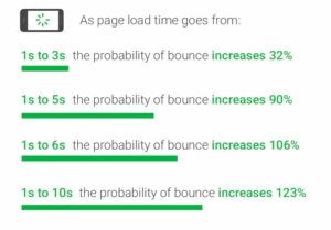
The Problem: In 2018, Google announced that slow website speed would be a definite ranking factor, meaning it can seriously hurt a website’s performance. The bad news is that most websites still take more than 15 seconds to load, which sends a very negative signal to search engines.
Moreover, studies have shown that if a website takes 10 to 15 seconds to load, the bounce rate can increase by a staggering 123%—a significant loss for website owners.
The Fix:
- Optimize images by compressing them without sacrificing quality. Tools like TinyPNG can help.
- Minimize HTTP requests: Reduce the number of elements (scripts, images, etc.) that need to be loaded.
- Enable browser caching so that users don’t have to reload assets every time they visit a page.
- Use lazy loading to load images and videos only when they are needed, i.e., when the user scrolls to them.
- Leverage a Content Delivery Network (CDN) to speed up the delivery of your content globally.
By reducing your website’s load time, you’ll improve user satisfaction and increase the likelihood of retaining mobile visitors.
2) Messy Website Menu
The Problem: A complex or confusing menu is one of the 12 things that drive mobile users away. Since mobile screens are smaller, they need a clean and easy-to-navigate menu. If the menu is cluttered or difficult to use, it can cause frustration—especially for users in a hurry.

The Fix:
- Simplify the menu: Keep the most essential links visible and organize them into categories.
- Use hamburger menus to save space and provide a neat navigation structure.
- Sticky navigation: Consider implementing a sticky navigation bar, so users don’t have to scroll back to the top to find the menu.
- Ensure that the links are large enough to be tapped easily and avoid placing them too close together.
By streamlining your mobile navigation, visitors will be able to find what they’re looking for faster, which can lead to a better user experience.
3) Too Many Interruptive Ads
The Problem: Mobile users are particularly sensitive to interruptive ads. Pop-ups, interstitials, and auto-playing videos can be annoying and make the browsing experience unpleasant. In some cases, Google has even penalized sites with intrusive ads, especially when they block the main content.
The Fix:
- Avoid using pop-up ads on mobile altogether. If they are essential, make sure they’re easy to close and don’t cover the entire screen.
- Use non-intrusive ads that blend into the content without disrupting the user’s flow.
- Consider using native advertising, which integrates seamlessly with the content and doesn’t feel disruptive.
Reducing the number of interruptions on your site can improve user experience, leading to longer visits and a higher chance of conversion.
4) Missing Action Buttons
The Problem: If your website doesn’t have clear Call to Action (CTA) buttons, mobile users may not know what to do next. A lack of actionable buttons can confuse visitors and cause them to leave your site without taking the desired action.
The Fix:
- Ensure that your CTA buttons are visibly placed, easy to tap, and include action-driven text (e.g., “Buy Now,” “Learn More,” or “Get Started”).
- Use large buttons that are easy to tap on small mobile screens.
- Make sure the buttons stand out visually with contrasting colors to draw attention.
Having clear and compelling CTA buttons ensures visitors know exactly what to do next, whether that’s making a purchase, signing up for a newsletter, or learning more about your services.
5) Non-Targeted Content
The Problem: Content that doesn’t meet the needs of mobile users will lead them to bounce. For instance, lengthy paragraphs or irrelevant information can frustrate visitors, especially when they’re on a mobile device looking for quick answers.
The Fix:
- Prioritize mobile-first content: Think about the content your mobile users are looking for and make it easy for them to access.
- Use short paragraphs, bullet points, and subheadings to break up text and make it scannable.
- Focus on content that answers questions or provides solutions, so visitors don’t have to sift through irrelevant material.
By optimizing content for mobile users’ needs, you’ll keep them engaged and more likely to take action.
6) No Proof of Trustworthiness
The Problem: If your website lacks trust signals such as security badges, customer reviews, or contact information, visitors may feel hesitant to make a purchase or share their personal information.
The Fix:
- Add trust signals such as SSL certificates, security badges, and payment security logos to reassure visitors that their data is safe.
- Display customer reviews and testimonials prominently to build credibility.
- Make sure contact information (phone numbers, email, physical address) is easy to find.
Trust is essential for conversions, and showing visitors that your site is secure and credible will help them feel comfortable taking action.
7) Content Not Prioritized for Mobile Intent
The Problem: Desktop versions of websites often prioritize desktop content over mobile-specific content. This means mobile visitors might have to zoom in or scroll excessively to find what they’re looking for.
The Fix:
- Prioritize mobile-specific content: For instance, make sure important information (such as pricing, services, or contact info) is easily accessible without excessive scrolling.
- Above the fold: Ensure that key details are visible on the screen immediately without the need to zoom in or scroll.
- Focus on concise content that meets the mobile user’s intent.
By making content more accessible on mobile, you’ll help visitors quickly find what they need and improve engagement.
8) Hard-to-Read Fonts
The Problem: Small or hard-to-read fonts are one of the main reasons mobile visitors leave websites. Mobile users shouldn’t have to pinch-to-zoom to read text.
The Fix:
- Use larger font sizes for body text (at least 14px) and headings.
- Ensure that there’s sufficient contrast between the text and the background to make it readable in various lighting conditions.
- Choose legible fonts that are easy to read on small screens, avoiding overly decorative styles.
Readable fonts contribute to a better user experience and keep visitors from abandoning your site.
9) Boring Design
The Problem: A stale, outdated, or overly complicated mobile design can make users feel uninvited and lead to them leaving your site.
The Fix:
- Update your design to be modern and visually appealing. A clean, sleek design that’s easy to navigate will keep users engaged.
- Use high-quality images, attractive color schemes, and a consistent layout to make the site appealing.
- Avoid overwhelming visitors with too many elements or overly flashy designs.
A visually appealing design draws visitors in and keeps them interested in exploring your content.
10) Poorly Designed Product Listings
The Problem: If your product listings are hard to view or poorly organized on mobile, visitors may get frustrated and leave before making a purchase.
The Fix:
- Ensure that product images are clear and properly sized for mobile screens.
- Use easy-to-navigate filters to help users sort through products.
- Provide clear, concise descriptions and pricing information.
A well-organized product listing will help users make purchasing decisions faster and with confidence.
11) Unclear Payment Process
The Problem: A confusing or lengthy checkout process can drive users away, especially on mobile devices.
The Fix:
- Simplify the checkout process by reducing the number of steps needed to complete a transaction.
- Use autofill options and make sure fields are large enough to tap.
- Offer multiple payment options and make sure users can easily navigate through the payment steps.
A smooth and easy checkout experience leads to higher conversion rates.
12) Ignoring Mobile SEO
The Problem: Failing to optimize your website for mobile SEO can cause your site to rank poorly in search results, which in turn reduces visibility and traffic.
The Fix:
- Use mobile-friendly SEO practices like optimizing meta descriptions, titles, and content for mobile search queries.
- Ensure that your website is responsive, meaning it adapts to different screen sizes and devices.
- Implement local SEO strategies to make your site more discoverable for mobile users searching for local products or services.
By focusing on mobile SEO, you increase your chances of ranking higher in search results and attracting more mobile visitors.
Conclusion
Optimizing your website for mobile isn’t just a luxury; it’s a necessity. By addressing these 12 mobile mistakes and implementing the fixes, you can significantly improve the user experience on mobile devices, reduce bounce rates, and increase conversions. Be proactive and test your site with Google’s Mobile-Friendly Test regularly to ensure it meets the needs of your mobile users.
Remember, a smooth mobile experience keeps visitors engaged and makes your website more accessible to a wider audience. Don’t wait for your users to leave—fix these issues now!
Don’t wait for your users to leave—fix these issues now! Need help optimizing your site? Contact Us today and let our experts take care of it.